Declines of American Kestrel Populations


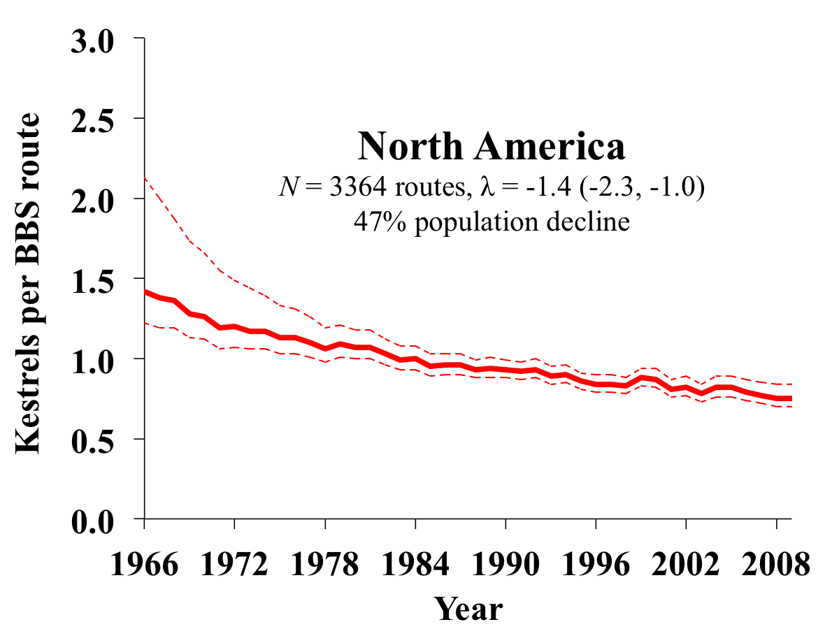
Data from the US Geological Survey's Breeding Bird Survey, National Audubon Society's Christmas Bird Count, nestbox monitoring programs (Smallwood et al. 2009), and Raptor Population Index (migration counts), collectively indicate long-term declines of American Kestrel populations in numerous regions of North America.

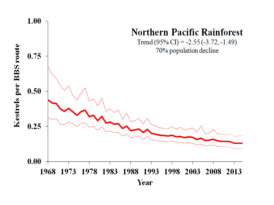
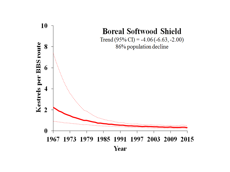
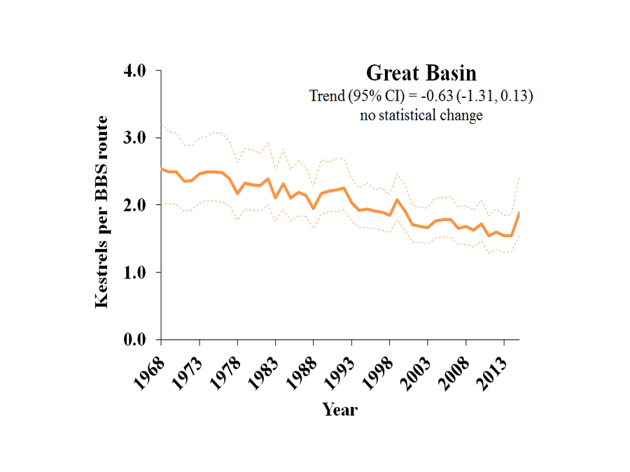
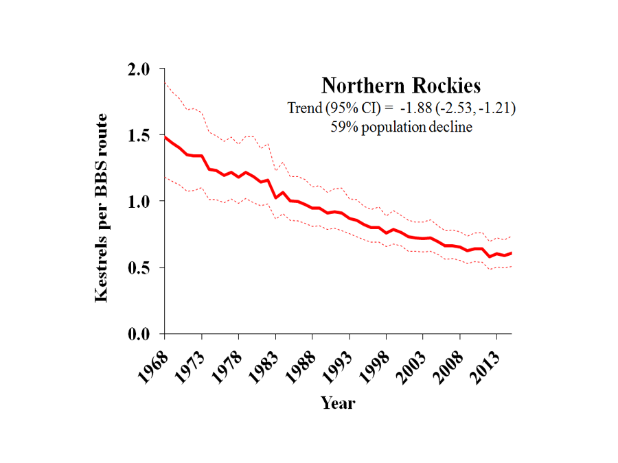
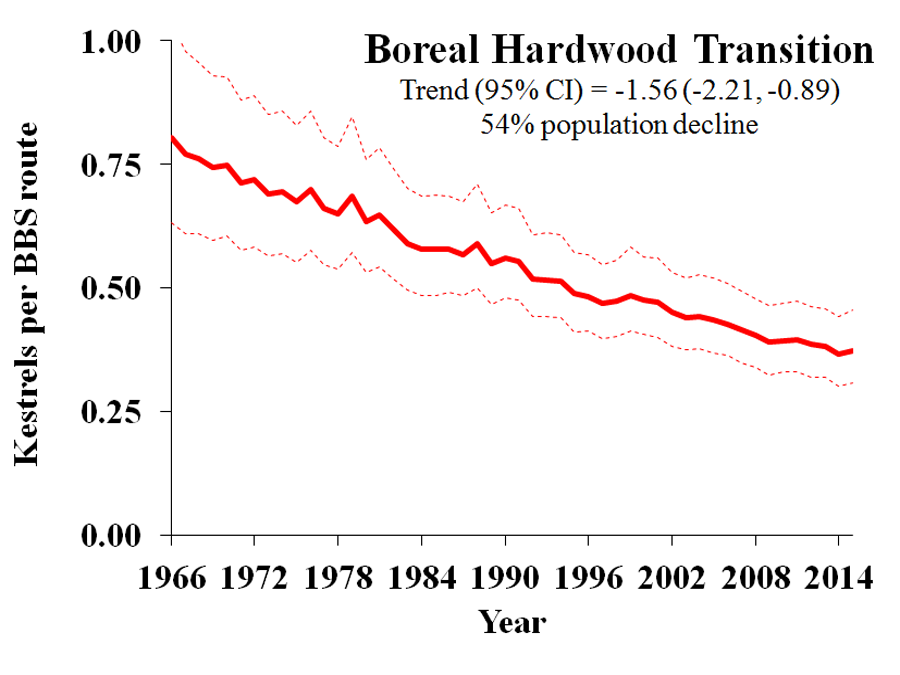
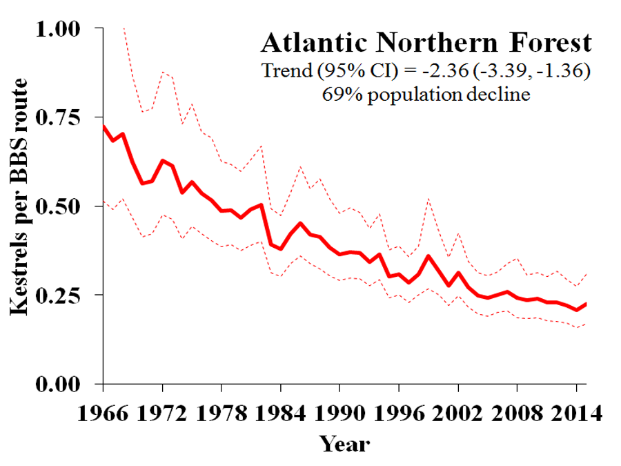
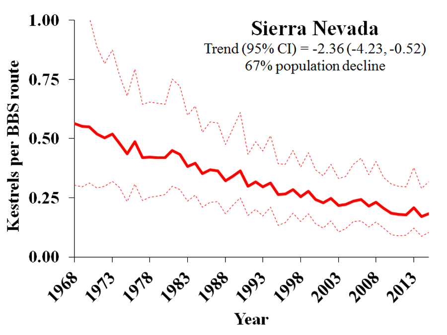
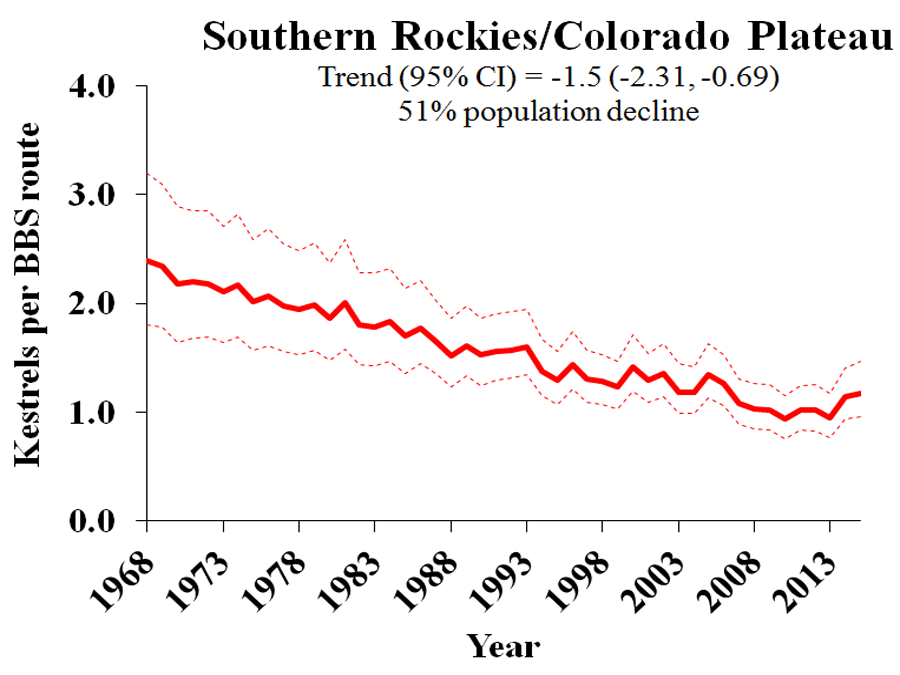
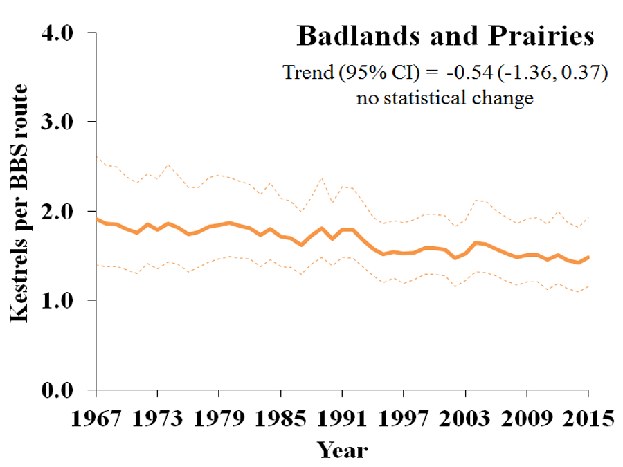
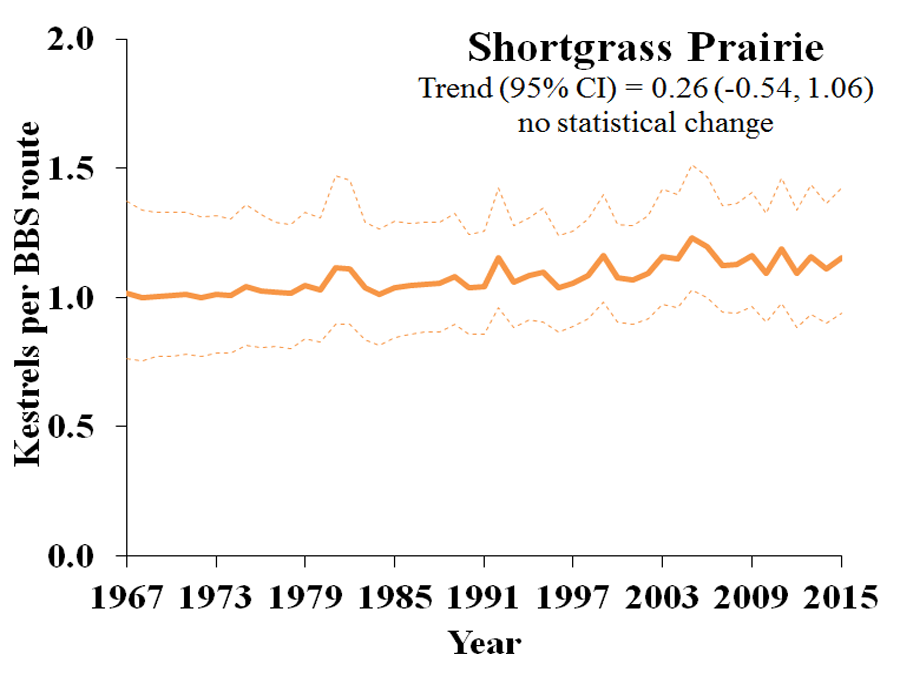
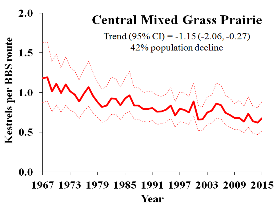
The map below illustrates model-estimated average % annual population change, based on Breeding Bird Survey (BBS) data, for Bird Conservation Regions (BCRs), which were developed by the North American Bird Conservation Initiative and are based on similar bird communities, habitats, and resource management issues.

Selecting a BCR from the list on the right will produce a graph showing the BCR’s model-estimated average number of American Kestrels counted per BBS route (24.5 mi/39.2 km) per year, typically from the late 1960s to 2010, depending on data availability.

Map of population declines

BCR map


Map Key


Red - Decline:
Represent model-estimated averages of % annual population decline with 95% credible intervals that do not overlap zero, indicating moderate variation and reasonable precision around the average.
 
Green - Growth:
Represent model-estimated averages of % annual population growth with 95% credible intervals that do not overlap zero, indicating moderate variation and reasonable precision around the average.
 
Orange - Trend Uncertain:
Represent estimated averages of % annual population change (+ or -) with 95% credible intervals THAT DO overlap zero, indicating high variation and low precision around the average, often because of low sample size/number of BBS routes. These estimates of population change can be less reliable and representative of reality.
 
Solid Line:
Represents model-estimated, route-level average abundance per year, and dashed lines represent 95% credible intervals for the averages.

N: number of BBS survey routes within BCRs that provided the data for estimates of abundance and population change.

λ (Greek letter Lambda): model-estimated average % annual population change. Parenthesized values represent the 95% credible interval for λ. Generally, if the 95% credible interval does not overlap zero (indicated by red or green graphs), then we can have a higher level of confidence in the trend’s reality, whereas credible intervals that overlap zero and are less reliable are indicated by orange graphs.

% population change is a simple ratio of average abundance estimates for 1966 and 2010.